Colonia
Kölsche Kaffee
Kölsche Kaffee
Overview
The coffee market is saturated and dominated by global players. Colonia was created as a response — a coffee brand built entirely around local identity. The concept borrows from the success of regional products like Kölsch beer, translating that principle into the world of coffee. The result is a brand that offers more than a beverage — it delivers a taste of Cologne’s spirit, forging a deep connection between product and place.
project
Brand Design (team project)
semester
Winter 2024 - 2025
focus / role
Concept Development Brand Design Art Direction
software
Adobe Illustrator Adobe Photoshop Adobe After Effects
ai assistance
Chat GPT Runway
Project Details
problem
The core question was how a new brand could find space in a market controlled by international corporations. Most established coffee brands operate globally, offering a standardized experience that rarely reflects a distinct cultural or regional identity. The challenge was therefore to uncover a niche rooted in authenticity — a positioning that extends beyond flavor and into meaning.
insight
A look outside the coffee industry revealed the key insight: products like beer (Kölsch) and wine draw their strength from regional origin. They embody tradition, community, and local pride. That sense of cultural belonging was missing from coffee. This led to the hypothesis that people also long for a coffee that reflects their home and lifestyle — a drink with roots.
solution
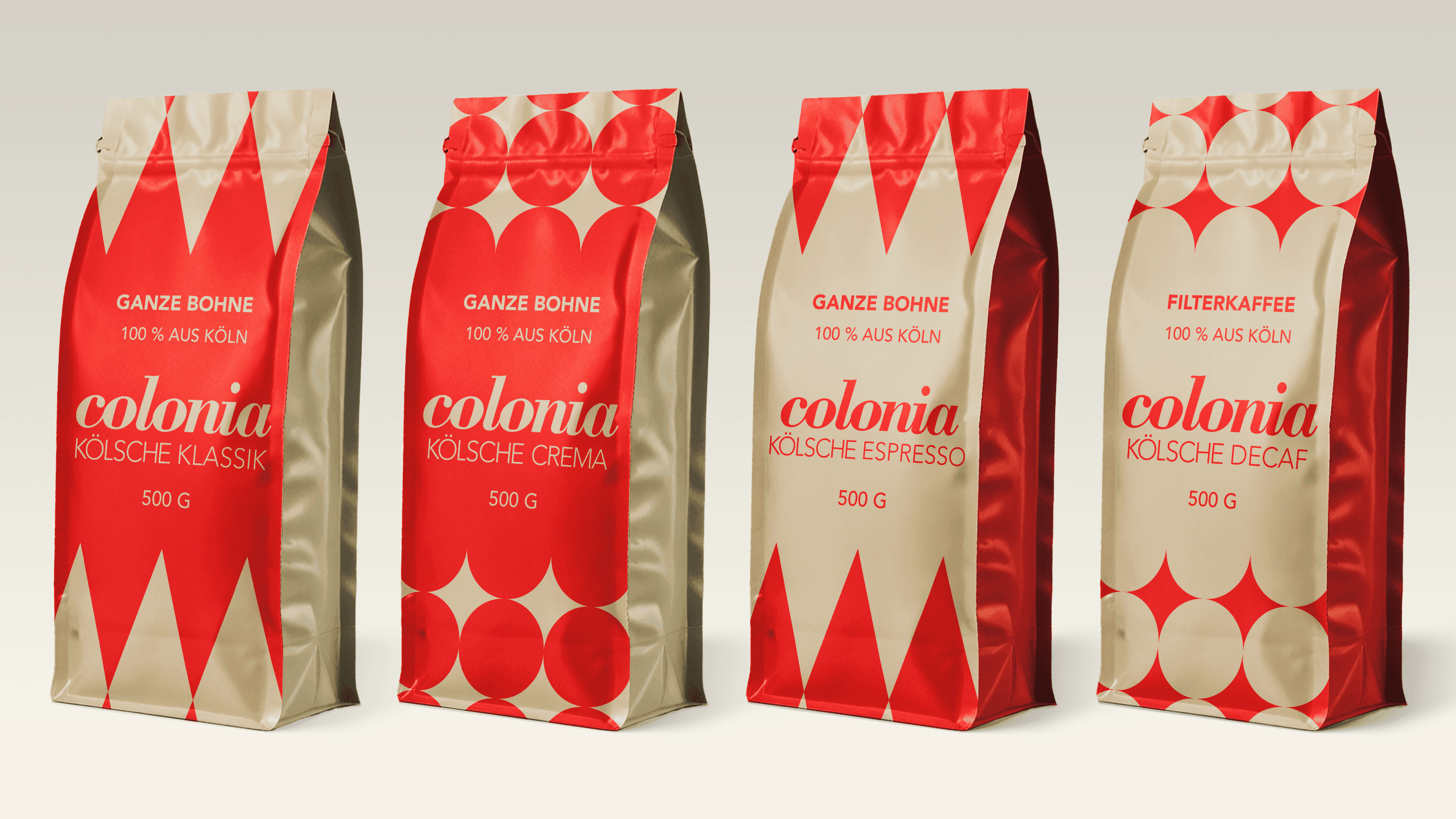
The Colonia brand identity is built on a modular design system that translates essential aspects of Cologne into a visual language. Color palette: The city colors, red and white, form the foundation. The white is softened with a warm beige tone, reminiscent of the Cologne Cathedral’s aged stone — creating a grounded, earthy warmth. Typography: The timeless Bodoni typeface is used exclusively for the brand name colonia, while all other text is set in the clean, modern Avenir. This pairing creates a typographic dialogue between heritage and modernity. Patterns: Two key motifs shape the visual language. A structured diamond grid draws from the Gothic geometry of the cathedral, while a loose circle pattern captures the confetti of Carnival. Both patterns are applied flexibly across various media. The system was applied consistently to every touchpoint — from packaging and mobile coffee stands to digital platforms and campaign materials.
result
The outcome is the complete conception and design of Colonia – Kölsche Kaffee. The brand achieves a clear, differentiated position through its strong local grounding and a design system that feels both traditional and contemporary.
learning
The most demanding part of the project was developing the concept itself. The key learning: the most resilient ideas often emerge not from analyzing the target market directly, but from observing and translating principles from adjacent industries. The project demonstrated the importance of letting go of early ideas to arrive at a strategically sound and distinctive solution.
Project Details
problem
The core question was how a new brand could find space in a market controlled by international corporations. Most established coffee brands operate globally, offering a standardized experience that rarely reflects a distinct cultural or regional identity. The challenge was therefore to uncover a niche rooted in authenticity — a positioning that extends beyond flavor and into meaning.
insight
A look outside the coffee industry revealed the key insight: products like beer (Kölsch) and wine draw their strength from regional origin. They embody tradition, community, and local pride. That sense of cultural belonging was missing from coffee. This led to the hypothesis that people also long for a coffee that reflects their home and lifestyle — a drink with roots.
solution
The Colonia brand identity is built on a modular design system that translates essential aspects of Cologne into a visual language. Color palette: The city colors, red and white, form the foundation. The white is softened with a warm beige tone, reminiscent of the Cologne Cathedral’s aged stone — creating a grounded, earthy warmth. Typography: The timeless Bodoni typeface is used exclusively for the brand name colonia, while all other text is set in the clean, modern Avenir. This pairing creates a typographic dialogue between heritage and modernity. Patterns: Two key motifs shape the visual language. A structured diamond grid draws from the Gothic geometry of the cathedral, while a loose circle pattern captures the confetti of Carnival. Both patterns are applied flexibly across various media. The system was applied consistently to every touchpoint — from packaging and mobile coffee stands to digital platforms and campaign materials.
result
The outcome is the complete conception and design of Colonia – Kölsche Kaffee. The brand achieves a clear, differentiated position through its strong local grounding and a design system that feels both traditional and contemporary.
learning
The most demanding part of the project was developing the concept itself. The key learning: the most resilient ideas often emerge not from analyzing the target market directly, but from observing and translating principles from adjacent industries. The project demonstrated the importance of letting go of early ideas to arrive at a strategically sound and distinctive solution.


Ready for my internship. (I think.)
Ready for my internship. (I think.)
Ready for my internship. (I think.)